The Problem: Default Preview Images Make Bland Profiles
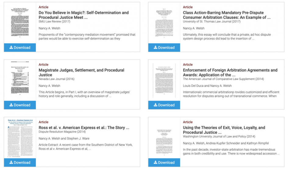
When you upload a document to EGS like the PDF of an article, the default preview and thumbnail image is usually black and white text, and the visual presentation of articles and book chapters can quickly become bland and repetitive.
Example of default PDF upload card view
There are two views that can be enabled: Card View and List View. List View disables thumbnails from being displayed on the main profile page, and Card View displays thumbnails to the left of metadata like title and publication. To toggle between the views, go to the profile’s Account Settings and look for the “Works Display” section. List View is a good option for anyone looking to fit as many works as possible onto the screen, and thumbnail images are still supported and displayed when a user brings up individual works.
Screenshot of Account Settings to choose between Card
