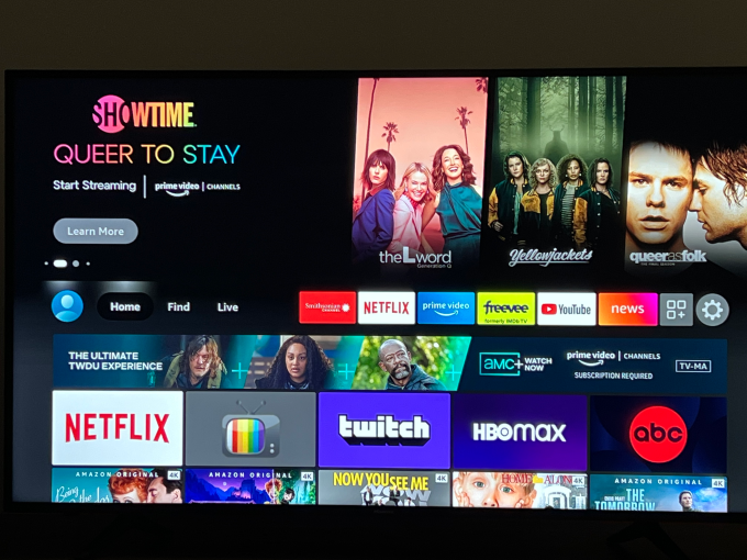
Amazon Fire TV revealed an updated user interface that aims to improve the navigation experience for users. Instead of a text menu item, there will now be an icon-based navigation bar that offers quick access to popular destinations, including “Home,” “Find,” “Live” and “My Stuff”, with icons like a magnifying glass, bookmark, house and so forth.
The changes are meant to address some of users’ complaints about last year’s Fire TV makeover, by refining several features, bringing back missing sections and simplifying navigation.
As part of the revamp, Amazon renamed “Library” to “My Stuff” — a term also used by Hulu — yet this tab still contains the same watch lists, video libraries, recently launched apps, as well as rented or purchased content. This slight change will most likely cause the most excitement among Fire TV users, as the “Library” tab was removed from the navigation menu last year.
The “Find” section didn’t
